General – Getting Started
Trading the currency markets is a complex business. With so many pairs and multiple timeframes, it is almost impossible to monitor them all – but with the Currency Heatmap for NinjaTrader, you can. The Currency Heatmap indicator delivers the information you need to base your trading decisions on the entire spectrum of currency pairs derived from the 8 major currencies; namely the US dollar, the Euro, the British Pound, the Swiss Franc, the Japanese Yen, the Canadian Dollar, the Australian Dollar and finally the New Zealand Dollar. In one clear and simple table, you can see instantly the entire weight of market sentiment across all 28 pairs and across all timeframes. A global view of risk and sentiment on one chart.
It instantly displays the “hottest” and “coldest” areas of the financial landscape. Vertically, 28 currency pairs are listed and ranked from the most bullish (top) to the most bearish pair (bottom) and reflect the data ranking on the associated currency matrix indicator. And this is where it gets interesting: horizontally, the performance scores of each currency pair are displayed in 10 timeframes namely 1 minute, 5 minutes, 10 minutes, 15 minutes, 30 minutes, hourly, 4 hours, daily, weekly and monthly.
Interpreting the colors
Each cell of the Currency Heatmap indicator for NinjaTrader is color coded making it possible to interpret it instantly with just a glance, much like looking at a sophisticated thermal imagery scanner, but for Forex. If you check out the indicator, you’ll see how easy and intuitive it is, but let’s just expand on them here.
If we start with the performance scores. This is the value the indicator assigns to each currency pair representing how positively or negatively its price moved over a certain period. The Currency Heatmap calculates the performance scores the same way the Currency Matrix does but with a slight difference due to minor data constraints which does not affect the accuracy of the indicator in any way. The cells can be any of the two colors depending on the performance score. This is the color coding used when viewing the currency pairs ACROSS the 10 timeframes or what we like to call the time horizon:
- Green – if the currency pair’s performance score for the aligned timeframe is POSITIVE.
- Red – if the currency pair’s performance score for the aligned timeframe is NEGATIVE.
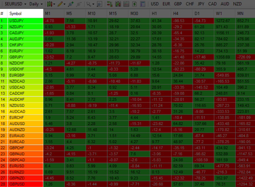
However, the pairs are then ranked VERTICALLY using a dynamic graded color code transitioning from green, to yellow, and to red in that order. The performance scores of the currency pairs in 10 timeframes are added together. The currency pairs are then ranked by their sum from the most positive to the most negative and are color coded as follows:
- Green shades – the sum of the currency pair’s performance scores in 10 timeframes is well above the fulcrum of zero.
- Yellow shades – the sum of the currency pair’s performance scores in 10 timeframes is relatively flat and around the fulcrum of 0. It can either be positive or negative but trails the numbers closest to 0.
- Red shades – the sum of the currency pair’s performance scores in 10 timeframes is well below the fulcrum of zero.
The gradation of color is dynamic and hence the transition of colors will depend entirely on the sum of the currency pair’s performance scores in 10 timeframes as explained above. As with all our other indicators, this is dynamic and is constantly shifting in real time to reflect the ebb and flow of sentiment across the timeframes.
Weight of the timeframes
One important factor to consider when interpreting the Currency Heatmap indicator for NinjaTrader and the ranking aspect, is the fact that the performance scores in each timeframe inherently possess weight, and this is reflected in how the indicator has been developed. As you can appreciate, the weight of sentiment in a slower timeframe is greater than that in a faster timeframe. Simply put, the weight of each timeframe is directly proportional to the timeframe itself. Faster timeframes carry less weighting to the overall ranking, whilst slower timeframes carry more. This means currency pairs ranking near or at the bottom of the ladder (bearish) are most likely to have red cells through the slower timeframes or the columns at the right hand side of the indicator. Similarly, the currency pairs at the top and ranking as bullish or very bullish, again are most likely to have green cells through the slower timeframes.
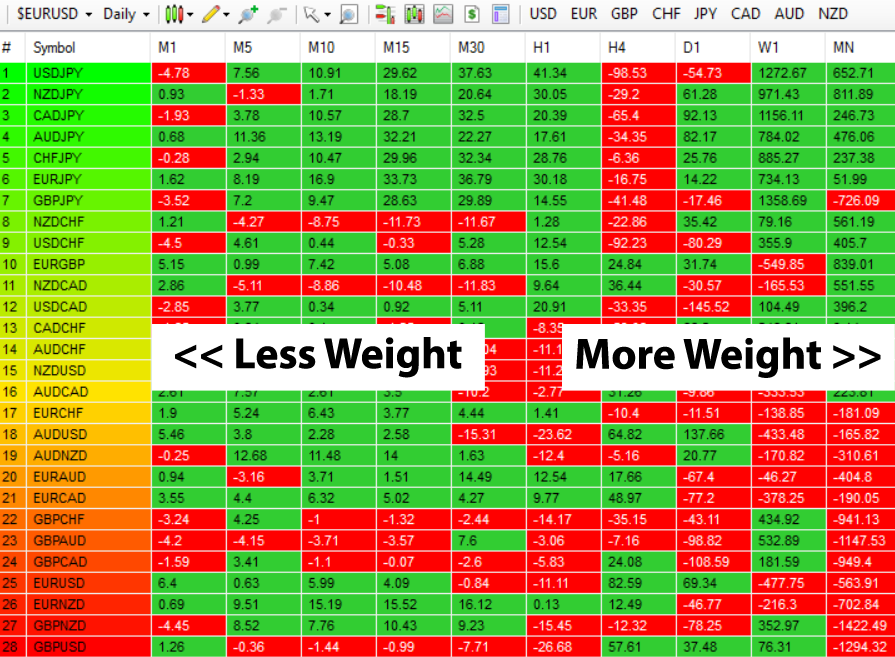
Stepping back, the changing colors deliver a heatmap reflecting the relative performance of the 28 currency pairs across ALL timeframes in real time. This gives a horizontal analysis of the currency pairs across time. Immensely powerful. And empowering you as a trader to make clear, logical and fast decisions.
Currency filter
The Currency Heatmap indicator for NinjaTrader allows you to filter the currency pairs relevant to the currency you are analysing. Just like the Quantum Currency Matrix indicator, a set of toggle buttons are available for this purpose which is located at the chart toolbar.
- USD is the red button which filters out and displays all currency pairs containing the US Dollar.
- EUR is the orange button which filters out and displays all the currency pairs containing the Euro.
- GBP is the yellow button which filters out and displays all the currency pairs containing the British Pound.
- CHF is the green button which filters out and displays all the currency pairs containing the Swiss Franc.
- JPY is the magenta button which filters out and displays all the currency pairs containing the Japanese Yen.
- CAD is the purple button which filters out and displays all the currency pairs containing the Canadian Dollar.
- AUD is the blue button which filters out and displays all the currency pairs containing the Australian Dollar.
- NZD is the white button which filters out and displays all the currency pairs containing the New Zealand Dollar.
Click then once to filter, and then click again to remove the filter. When a certain currency filter is in effect, the relevant currency pairs in the table appear colored while the others are not.
Getting started
Here are some further details on the Currency Heatmap indicator to help you get started:
- Before attaching the indicator to a chart, please remember to set the timeframe to DAILY, otherwise the indicator will not work.
- Your Quantum Currency Heatmap indicator can be applied to any chart for any currency pair. The chart does not influence or affect the appearance or performance of the indicator. For example, you can apply the indicator to a EURUSD, a GBPUSD, or a USDCHF, or any other pair.
- The indicator occupies the chart panel itself. We recommend expanding the chart until you get a complete view of the indicator.
- When you first apply the indicator, please allow a few seconds for the data to build in history.
By itself, the Quantum Currency Heatmap indicator is a powerful trading tool for identifying trading opportunities, quickly, easily on a single chart. However, its development is part of a new indicator bundle that we like to call the Quantum Currency Dashboard which consists of the following indicators:
- Quantum Currency Strength Indicator (CSI)
- Quantum Currency Matrix
- Quantum Currency Array
- Quantum Currency Heatmap
These four indicators then provide a unique and compact insight into all the various aspects of strength and weakness for both currencies and currency pairs from trend and momentum to overbought and oversold. What is unique is that using four charts you are then able to monitor the myriad combinations of strength, weakness, momentum, congestion and divergence across the entire forex complex at a click of a button. And even more powerfully giving you the confidence to get in and stay in for maximum profits. No more missed opportunities, no more struggling with multiple charts, and no more trader regret whatever your trading style approach.
Installation
Open your NinjaTrader platform and select a chart
- Right click – this will open the following window:
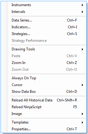
- Left click > Indicators
This will open the following window: (you can also open this window in another way by clicking on the Indicators icon in the NinjaTrader toolbar) 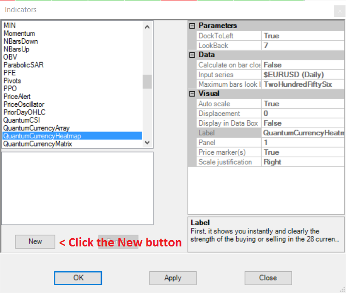
Scroll down to the QuantumCurrencyHeatmap indicator:
- Left click > This will highlight the indicator in blue
- Left click > ‘New’ button as shown above
This will add the QuantumCurrencyHeatmap indicator in the box below as shown here:
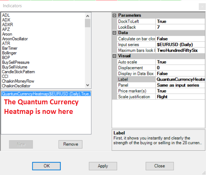
Before clicking the OK or Apply button to complete, the indicator has one or two options which can be configured. You can click the Apply button at any time, and this will apply any changes you have made to the indicator, without closing the window. This will allow you to see the changes you have made, and to modify again before closing with the OK button, or the Close button. All of the user configuration is done on the right hand side of the above screen, which is shown enlarged below. These are the default settings when you first install the indicator to a chart.
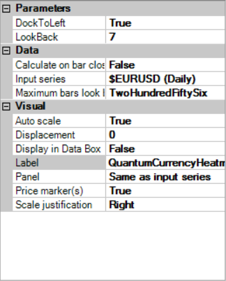
Parameters
DockToLeft– This parameter controls the position where the indicator is docked at the chart. Its default value is True which places the indicator at the left hand side of the chart.
LookBack – The value of this parameter determines the starting point of the period the indicator processes up to the most current bar. By default, the indicator looks back to 7 bars.
BookmarkedCurrencyPairs – This is a new feature we added to the Currency Heatmap which helps you keep track of currency pairs you’re interested in wherever they are in the list. To bookmark a currency pair, simply enter its symbol (without any prefix or suffix) in this field like so:
eurusd
You can bookmark multiple currency pairs at the same time by adding a space between them. For example, if you like to bookmark EURUSD, AUDCHF and USDJPY, simply enter the following value in this field:
eurusd audchf usdjpy
All bookmarked currency pairs are given a distinct color so you can see them easily in the constantly changing list. They are also not affected by the currency filters.
Data
These are the Data inputs:
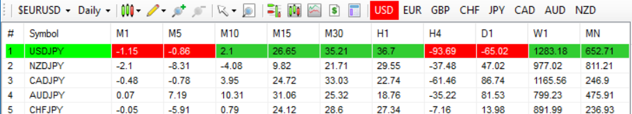
Calculate on bar close – please DO NOT change this setting and leave as the default of False Input series – this shows the timeframe for the indicator and will be displayed according to the chart time. In this case the indicator was attached to a EURUSD 5min chart
Maximum bars look back – this is the maximum number of bars in the look back for the indicator. We suggest you leave this as the default of TwoHundredFiftySix as it is memory friendly
Visual
These are the Visual inputs:
Auto Scale – DO NOT change this setting and leave this as the default of True
Displacement – DO NOT change this setting and leave this at the default of 0
Display in Data Box – we suggest you leave this at the default of False
Label – this is the label which will display on the chart once the indicator is attached. You can remove this if you wish as follows:
- Place your mouse on the Label label, and left click. This will highlight Label in blue. Left click in the value field alongside and your cursor will appear. Delete the text using the back button and when you apply the indicator, the text will no longer be displayed
Panel – please DO NOT alter this setting
Price Marker(s) – please DO NOT alter this setting and leave as the default of True Scale
Justification – please DO NOT alter this setting and leave as the default of Right
Removing an indicator
These are the steps to remove an indicator from a chart: Right click on the chart and then left click on Indicators from the pop up menu. Scroll down to the indicator you wish to remove and left click which will turn the indicator blue. This will then display the indicator window with its settings as shown below:
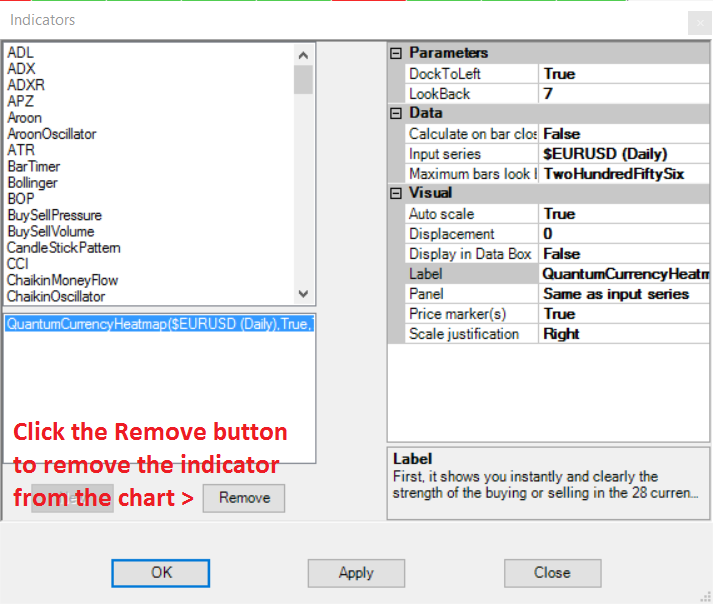 Simply left click on the Remove button as shown above, and the indicator will disappear from the list of indicators on the chart. To confirm left click the OK button to confirm and close the window.