General – getting started
If you’ve been trading for any time, you will almost certainly have come across the concept of support and resistance. This powerful and simple concept lies at the heart of technical analysis. It forms the cornerstone of price action trading and why we devloped the accumulation and distribution indicator for the Ninjatrader platform.
However, you can also think of support and resistance in another way. After all, these are also price areas where a market has paused, reversed, or moved into a congestion phase before moving on. As a result these price regions are associated with sustained buying and selling, or what Wyckoff called Accumulation and Distribution. These two concepts go hand in hand, and you can think of these in simple terms as follows:
- Accumulation relates to how an area of support performs
- Distribution relates to how an area of resistance performs
It is these two powerful concepts which come together in the Quantum Accumulation and Distribution indicator. It is the act of accumulation ( buying ) over a sustained period which creates the support region, whilst the act of distribution ( selling ) over a sustained period creates the resistance region. Having the power to see both, gives you unparalleled insights into price behaviour at these key levels, and the confidence to forecast future market behaviour as a result.
Most traders still draw their lines manually, leading to a crude interpretation of these key levels. Even those companies who have developed a trading indicator, have developed an equally imprecise tool. No doubt you’ve seen them. Generally these appear as wide bands on the chart, indicating vague areas of congestion, with associated support and resistance bands. These are virtually useless. They lack precision, or definition.
So, why has no one ever considered accumulation and distribution and the associated support and resistance as dynamic? After all, wouldn’t a dynamic indicator deliver high quality information where you need it most – at the live edge of the market?
Well perhaps no one has ever thought about it in this way before. After all, price action is dynamic.
Well, that’s what we thought too, and here it is at last – the Quantum Dynamic Accumulation and Distribution indicator for NinjaTrader. The first and only dynamic indicator in the world which displays two things simultaneously. The regions of accumulation and distribution, and from that, the associated price levels of support and resistance. Even more so, it also displays the strength of these regions, the number of times they have been tested, and the direction from which they were tested. This translates into a visual picture of the accumulation and distribution zones.
Finally, on your NinjaTrader platform, you will have an indicator that truly defines, with pinpoint accuracy, those areas of price support and resistance associated with accumulation and distribution which are so important to you as a trader.
It’s an immensely powerful indicator which maps out the direction of price at any given moment. For most traders, the profit that springs from trading, comes from determining these levels precisely. This indicator will give you the confidence to forecast where the market is likely to move next, giving you the ability to gauge:
- Optimum entry levels
- Safe exit levels
- Proper stop loss levels
- Excellent take profit levels
But as with all Quantum Trading indicators for NinjaTrader, there’s more, a great deal more!
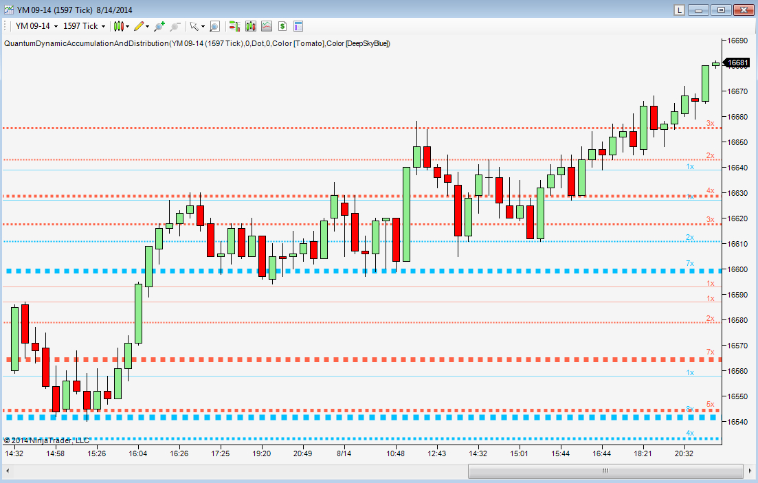
The indicator shows you both graphically and numerically, how many times the price region has been tested. Levels which have been tested several times, will appear as deeper lines, whilst those levels tested only once or twice will appear as narrower lines. This instantly reveals the depth of any accumulation or distribution regions, and hence the likelihood of the level holding or being breached. Each level is painted blue or red to show you whether that level has seen accumulation or distribution in the past. If the level is painted red, then this has been an area of price distribution, and if painted blue then this is accumulation. An area of price accumulation is likely to act as support if approached from above, and if breached from below, to then provide bullish support to a further move higher. Conversely, an area of price distribution is likely to act as resistance if approached from below, and if breached from above, to then provide bearish resistance to a further move lower. The indicator is dynamic, which means the support and resistance lines generated coincide with the current price action
Every market behaves slightly differently. They each have their own price characteristics which are then reflected in the price action, which in turn is reflected in the dynamic accumulation and distribution levels. So, once again, we have included your own fine control. Using the custom option, you can increase or decrease the number of zones that appear on each chart, to suit your own trading style and approach. Some traders prefer more detail, others prefer less. The indicator caters for everyone. It’s a personal choice. It simply means you have full control to customise the indicator the way you want it. Matching the tool to the job means greater consistency and greater profitability.
The Quantum Dynamic Accumulation and Distribution indicator works in all timeframes from tick charts to time based charts, and from minutes to months.
Installation
Open your NinjaTrader platform and select a chart
- Right click – this will open the following window:
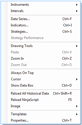
- Left click > Indicators
This will open the following window: (you can also open this window in another way by clicking on the Indicators icon in the NinjaTrader toolbar)
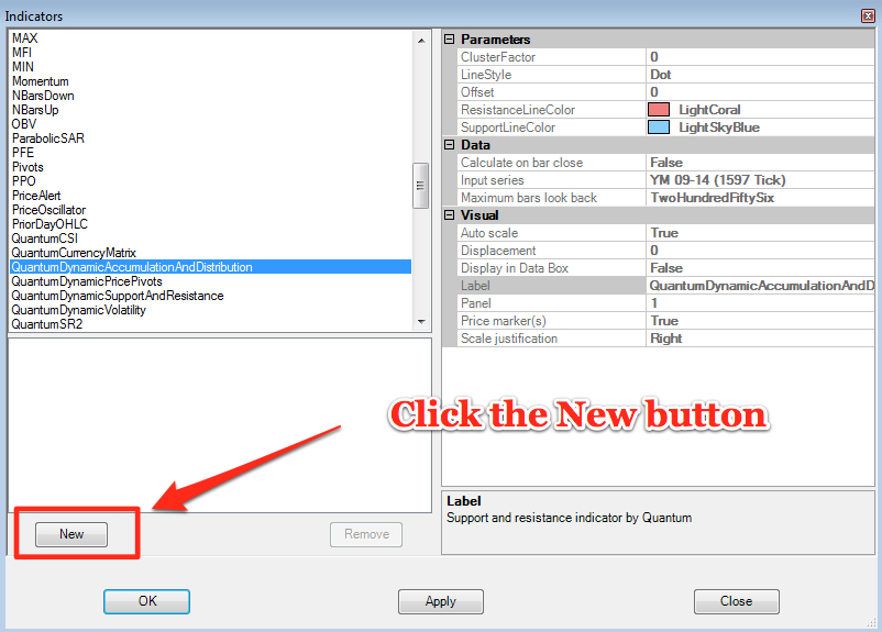
Scroll down to the QuantumDynamicAccumulationAndDistribution indicator:
- Left click > This will highlight the indicator in blue
- Left click > ‘New’ button as shown above
This will add the QuantumDynamicAccumulationAndDistribution indicator in the box below as shown here:
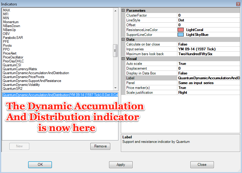
Before clicking the OK or Apply button to complete, the indicator has one or two options which can be configured. You can click the Apply button at any time, and this will apply any changes you have made to the indicator, without closing the window. This will allow you to see the changes you have made, and to modify again before closing with the OK button, or the Close button. All of the user configuration is done on the right hand side of the above screen, which is shown enlarged below. These are the default settings when you first install the indicator to a chart.
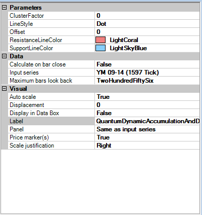
Parameters
These are the Parameters inputs:
ClusterFactor – this parameter is a constant in calculating the size of groups or clusters of zones generated by the indicator. It gives you full control over the number of accumulation and distribution zones that appear on the chart. Increasing this parameter causes the indicator to reduce the number of zones from the default of 0.
- Place your mouse on the ClusterFactor label, and left click. This will highlight ClusterFactor in blue. Left click in the value field alongside and your cursor will appear. Delete the default number using the back button and enter a new number, such as 20, 30 or 50 and above to reduce the number of zones on the chart. The number to enter will vary from instrument to instrument and from chart to chart, and also whether you are trading using a tick chart or a time based chart.
LineStyle – this parameter allows you to change the appearance of the zones. The default is a Dot. You can change this as follows:
- Left click on the LineStyle label, and then left click in the value field. A drop down arrow will then appear in the value field. Left click the arrow and select a different line style from those in the drop down menu
Offset – this parameter is used to adjust the position of the line labels ( the one that determines the number of times a level is tested). By default these are located on the right hand side of the chart. A value of 0 places them on the right of the chart, whilst a value of 100 places them on the left of the chart. To change the setting:
- Place your mouse on the Offset label, and left click. This will highlight Offset in blue. Left click in the value field alongside and your cursor will appear. Delete the default number using the back button and enter a new number, such as 10 to increase the indent from the right hand side or 100 if you prefer them over to the left of the chart.
ResistanceLineColor – this parameter is used to change the color of the resistance zone which displays distribution zones. The default is LightCoral. To change the color:
- left click on the ResistanceLineColor label which will turn blue. A drop down arrow will appear in the value field. Left click the drop down arrow and the color options will then be displayed. Use the scroller on the right to select your preferred color which will then appear in the value field alongside.
SupportLineColor – this parameter is used to change the color of the support zone which displays accumulation zones. The default is LightSkyBlue. To change the color:
- left click on the SupportLineColor label which will turn blue. A drop down arrow will appear in the value field. Left click the drop down arrow and the color options will then be displayed. Use the scroller on the right to select your preferred color which will then appear in the value field alongside.
Data
These are the Data inputs:
Calculate on bar close – please DO NOT change this setting and leave as the default of False
Input series – this shows the timeframe for the indicator and will be displayed according to the chart time. In this case the indicator was attached to a 1597 tick chart for the YM September contract for the Dow E mini future
Maximum bars look back – this is the maximum number of bars in the look back for the indicator. We suggest you leave this as the default of TwoHundredFiftySix as it is memory friendly
Visual
These are the Visual inputs:
Auto Scale – DO NOT change this setting and leave this as the default of True
Displacement – DO NOT change this setting and leave this at the default of 0
Display in Data Box – we suggest you leave this at the default of False
Label – this is the label which will display on the chart once the indicator is attached. You can remove this if you wish as follows:
- Place your mouse on the Label label, and left click. This will highlight Label in blue. Left click in the value field alongside and your cursor will appear. Delete the text using the back button and when you apply the indicator, the text will no longer be displayed
Panel – this specifies the panel number where the indicator will appear. We suggest you leave this as the default of Same as Input Series
Price Marker(s) – please DO NOT alter this setting and leave as the default of True
Scale Justification – please DO NOT alter this setting and leave as the default of Right
Removing an indicator
These are the steps to remove an indicator from a chart: Right click on the chart and then left click on Indicators from the pop up menu. Scroll down to the indicator you wish to remove and left click which will turn the indicator blue. This will then display the indicator window with its settings as shown below:
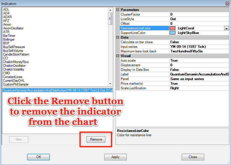
Simply left click on the Remove button as shown above, and the indicator will disappear from the list of indicators on the chart. To confirm left click the OK button to confirm and close the window.