General – getting started
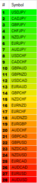
The Currency Array indicator for NInjaTrader has been developed to measure and display quickly and easily, the speed at which currency pairs are rising and falling. Just like the Quantum Currency Matrix, the Quantum Currency Array indicator displays the complete array of 28 currency pairs derived from the 8 major currency pairs as featured in the Quantum Currency Strength Indicator:
- US Dollar
- Euro
- British Pound
- Swiss Franc
- Japanese Yen
- Canadian Dollar
- Australian Dollar
- New Zealand Dollar
In displaying all the pairs in an array this gives an instant view of the relative trend strength and displays this relationship in a visual and intuitive manner in three ways. Each one shows a different perspective and insight into the complex world of currency strength concepts.
Ranked list
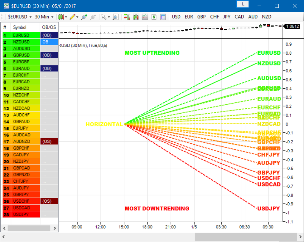
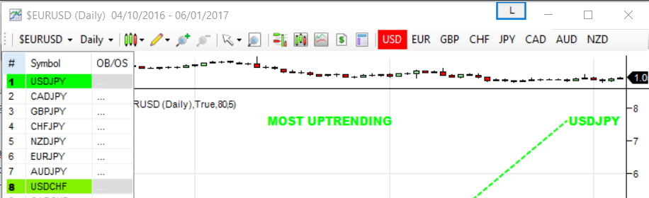
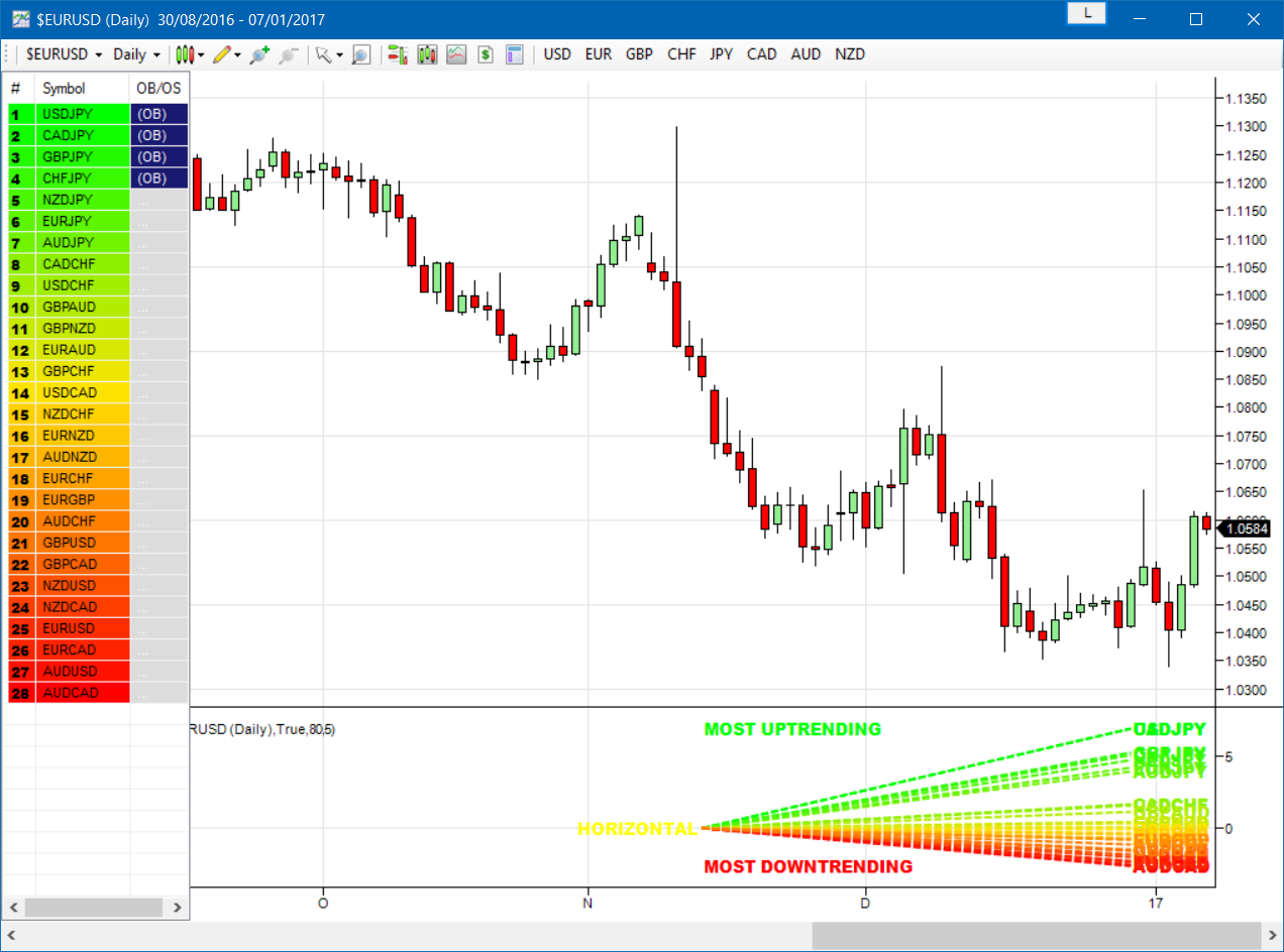
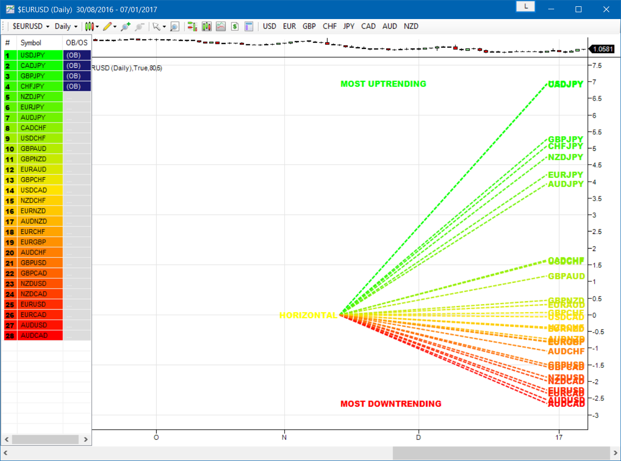
First, the indicator displays 28 major currency pairs in a ranked list ordered by the strength of the trend. The currency pair with the greatest momentum and steepest uptrend appears at the top of the list while the one with the greatest momentum and steepest downtrend appears at the bottom. All the other pairs are then ranked accordingly, and color coded from red at the bottom, to yellow and into green at the top of the ranking table. Currency pairs in congestion appear in the middle of the table.
In the ranked list, alongside the ranks of currency pairs is a second column that provides signals as to whether a particular currency pair is approaching an overbought or an oversold state. These are then signaled in two ways. First a signal the currency pair is approaching such a state, and second when it has arrived in this condition. These are coded as follows:
- (OB) – This signal appears as a dark shade of blue which means that the currency pair is APPROACHING an OVERBOUGHT state.
- OB – This signal appears as a bright shade of blue which means that the currency pair is IN an OVERBOUGHT state.
- (OS) – This signal appears as a dark shade of red which means that he currency pair is APPROACHING an OVERSOLD state.
- OS – This signal appears as a bright shade of red which means that the currency pair is IN an OVERSOLD state.
Once any of these signals appears beside a currency pair, it signals the potential impending change in direction of the trend, which can then be considered further by analysis of the chart. For example, if the EURGBP is seen at the very top of the list and beside it is an OB signal, it means that although the uptrend is seemingly strong, the bullish strength driving it may be reaching an exhaustion point, starting to diminish with a possible change in direction in due course.
Currency Array
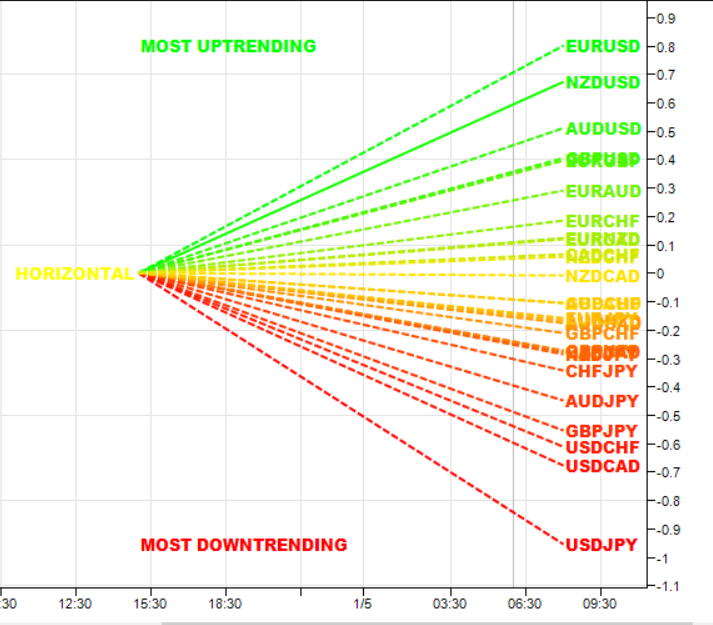
Secondly, it displays the same 28 major currency pairs as lines in a graph that diffuse out into the array and with varying magnitudes depending on the strength and inclination of each currency pair’s trend. This means the order in which they appear vertically follows the same ranking in the table alongside, but as a graphical display, instantly, visually and numerically revealing the actual steepness of each currency pair’s trend. As you would expect the currency pair with the fastest and steepest uptrend also has the steepest UPWARD line in the graph. Likewise, the fastest and steepest downtrend also has the steepest DOWNWARD line in the graph. Currency pairs with the least steepness in their trend (and in congestion) are found closest to the 0 level of the graph and appear horizontal.
You can also see each line in the array has one of 2 different line styles. Its style depends on the state of its corresponding currency pair as defined above.
- Dashed – This means the currency pair is trending, but not close to an overbought or oversold condition.
- Solid – This means the currency pair is at an overbought or oversold condition.
One of the most powerful features of the array when watching trends develop in real time is not only considering one pair, but how pairs move together ‘en masse.’ This can give you huge confidence when taking a position in the market, as you will see all the currency pairs for that complex “marching together” stretching higher or stretching lower and reflecting market sentiment for that currency and its associated pairs. This is immensely powerful and will give you the confidence not only to take a position but also to hold it to maximise your profits from the trend.
Currency filter
The Currency Array indicator for NinjaTrader allows you to filter the currency pairs relevant to the currency you are trying to focus on. Just like the Quantum Currency Matrix indicator, a set of toggle buttons are available for this purpose but is located at the chart toolbar.
- USD is the red button which filters out and displays all currency pairs containing the US Dollar.
- EUR is the orange button which filters out and displays all the currency pairs containing the Euro.
- GBP is the yellow button which filters out and displays all the currency pairs containing the British Pound.
- CHF is the green button which filters out and displays all the currency pairs containing the Swiss Franc.
- JPY is the magenta button which filters out and displays all the currency pairs containing the Japanese Yen.
- CAD is the purple button which filters out and displays all the currency pairs containing the Canadian Dollar.
- AUD is the blue button which filters out and displays all the currency pairs containing the Australian Dollar.
- NZD is the white button which filters out and displays all the currency pairs containing the New Zealand Dollar.
Click then once to filter, and then click again to remove the filter. When a certain currency filter is in effect, the relevant currency pairs in the table appear colored while the others are not.
Divergence
And this leads on to the third aspect of the Currency Array indicator which is this – it will give you an instant heads-up to divergence across a currency complex, and the easiest example here is with the Japanese yen which is the counter currency for the major and cross pairs. On the array we should expect to see all the currency pairs on one side of the mid point or the other. After all, if the flow of sentiment for the Yen is universal, then we would expect to see all the currency pairs aligned accordingly, whether with selling or the yen or buying. If not, then we have some divergence, and the flow of sentiment is not universal. If you are trading a pair which is perhaps counter to broad sentiment, then this is a high risk proposition. The currency array will tell you this instantly and visually and across all the timeframes with a single click and on ONE chart. No need to try to scan 28 charts. It is all here for you.
Dynamic graded color coding
One of the coolest features we have introduced recently across all our indicators is the dynamic graded color coding; found in both the ranked list and the graph which makes interpreting intuitive and fast. You can probably see instantly just from the images how easy it is, but we will walk you through anyway.
 The currency pairs appear as a color in the range of a green-yellow-red gradient (in that order). Simply put, the color of each currency pair varies depending on its value, in this case the steepness of the trend:
- Green shades – the steepness of the currency pair’s trend is positive and is well above the fulcrum of zero.
- Yellow shades – the steepness of the currency pair’s trend is relatively flat and around the fulcrum of 0. It can either be positive or negative but trails the numbers closest to 0.
- Red shades – the steepness of the currency pair’s trend is negative and is well below the fulcrum of zero.
The same color gradation applies to the array itself. It is important to note the yellow levels are not precisely in the middle of the list (rank 14 of 28). The gradation of color is dynamic and hence the transition of colors will depend entirely on the steepness of the trend of each currency pair as explained above. As with all our other indicators, this is dynamic and is constantly shifting in real time to reflect the ebb and flow of sentiment across the timeframes.
Getting Started
Here are some further details on the Currency Array indicator to help you get started:
- Your Quantum Currency Array indicator can be applied to any chart for any currency pair. The chart does not influence or affect the appearance or performance of the indicator. For example you can apply the indicator to a EURUSD, a GBPUSD, or a USDCHF, or any other pair. The indicator will display in an identical way on each chart.
- The indicator occupies its own indicator window in the chart. We recommend expanding the indicator vertically to get a complete view.
- The indicator works in all NinjaTrader timeframes.
- When you first apply the indicator, please allow a few seconds for the data to build in history.
By itself, the Quantum Currency Array indicator is a powerful trading tool for identifying trading opportunities, quickly, easily, and on ONE chart. However, it was developed as part of what we like to call the Quantum Currency Dashboard which consists of the following indicators:
- Quantum Currency Strength Indicator (CSI)
- Quantum Currency Matrix
- Quantum Currency Array
- Quantum Currency Heatmap
These four indicators then provide a unique and compact insight into all the various aspects of strength and weakness for both currencies and currency pairs, from trend and momentum to overbought and oversold. What is unique is that using four charts, you are then able to monitor the myriad combinations of strength, weakness, momentum, congestion and divergence across the entire Forex complex at a click of a button. And even more powerfully, giving you the confidence to get in and stay in for maximum profits. No more missed opportunities, no more struggling with multiple charts, and no more trader regret, whatever your trading style or approach.
Installation
Open your NinjaTrader platform and select a chart
- Right click – this will open the following window:
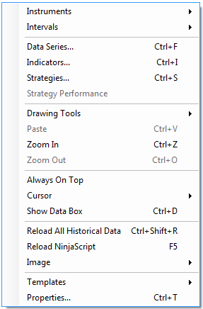
- Left click > Indicators
This will open the following window: (you can also open this window in another way by clicking on the Indicators icon in the NinjaTrader toolbar) 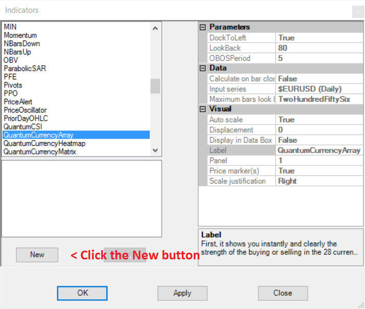
Scroll down to the QuantumCurrencyArray indicator:
- Left click > This will highlight the indicator in blue
- Left click > ‘New’ button as shown above
This will add the QuantumCurrencyArray indicator in the box below as shown here:
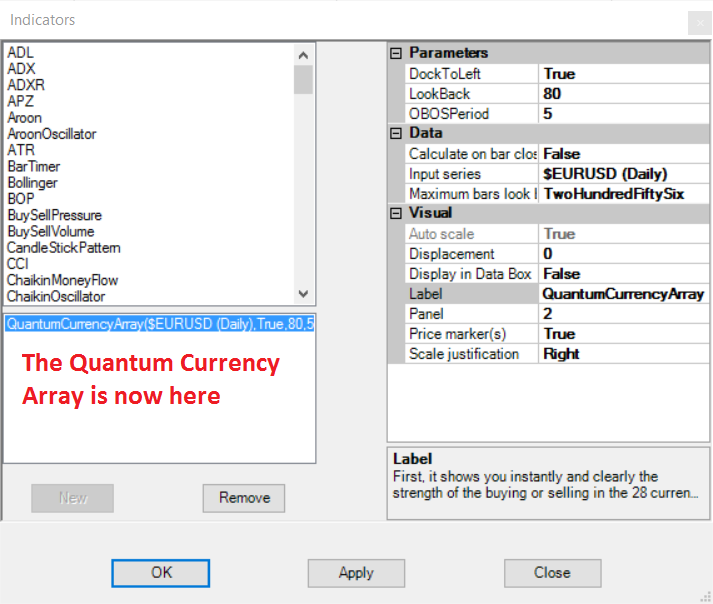
Before clicking the OK or Apply button to complete, the indicator has one or two options which can be configured. You can click the Apply button at any time, and this will apply any changes you have made to the indicator, without closing the window. This will allow you to see the changes you have made, and to modify again before closing with the OK button, or the Close button. All of the user configuration is done on the right hand side of the above screen, which is shown enlarged below. These are the default settings when you first install the indicator to a chart.
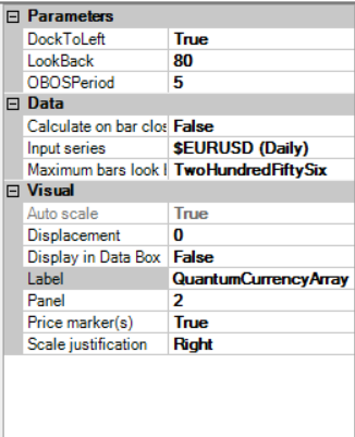
Parameters
BookmarkedCurrencyPairs – This is a new feature we added to the Currency Array which helps you keep track of currency pairs you’re interested in wherever they are in the list. To bookmark a currency pair, simply enter its symbol (without any prefix or suffix) in this field like so:
eurusd
You can bookmark multiple currency pairs at the same time by adding a space between them. For example, if you like to bookmark EURUSD, AUDCHF and USDJPY, simply enter the following value in this field:
eurusd audchf usdjpy
All bookmarked currency pairs are given a distinct color so you can see them easily in the constantly changing list. They are also not affected by the currency filters.
DockToLeft– This parameter controls the position where the indicator is docked at the chart. Its default value is True which places the indicator at the left hand side of the chart.
LookBack – The value of this parameter determines the starting point of the period the indicator processes up to the most current bar. By default, the indicator looks back to 80 bars.
OBOSPeriod – This parameter is a factor to calculating the Overbought/Oversold (OBOS) signals of each currency pair. It is expressed as the number of bars and is set to 5 bars by default.
Data
These are the Data inputs:
Calculate on bar close – please DO NOT change this setting and leave as the default of False Input series – this shows the timeframe for the indicator and will be displayed according to the chart time. In this case the indicator was attached to a EURUSD 5min chart
Maximum bars look back – this is the maximum number of bars in the look back for the indicator. We suggest you leave this as the default of TwoHundredFiftySix as it is memory friendly
Visual
These are the Visual inputs:
Auto Scale – DO NOT change this setting and leave this as the default of True
Displacement – DO NOT change this setting and leave this at the default of 0
Display in Data Box – we suggest you leave this at the default of False
Label – this is the label which will display on the chart once the indicator is attached. You can remove this if you wish as follows:
- Place your mouse on the Label label, and left click. This will highlight Label in blue. Left click in the value field alongside and your cursor will appear. Delete the text using the back button and when you apply the indicator, the text will no longer be displayed
Panel – please DO NOT alter this setting
Price Marker(s) – please DO NOT alter this setting and leave as the default of True Scale
Justification – please DO NOT alter this setting and leave as the default of Right
Resizing the indicator
When you first apply the Currency Array Indicator to the chart the indicator window may need resizing, and below is an example of how the indicator may look with the default white background of a NinjaTrader chart:
Aside from the ladder of currencies, the Currency Array for NinjaTrader also displays a graphical representation of this list which is displayed at a separate indicator window below the chart. To enlarge this space, simply hover your mouse at the top of the divider between the chart and the Currency Array’s graph, then click and drag it upwards until its space is maximised.
Removing an indicator
These are the steps to remove an indicator from a chart: Right click on the chart and then left click on Indicators from the pop up menu. Scroll down to the indicator you wish to remove and left click which will turn the indicator blue. This will then display the indicator window with its settings as shown below:
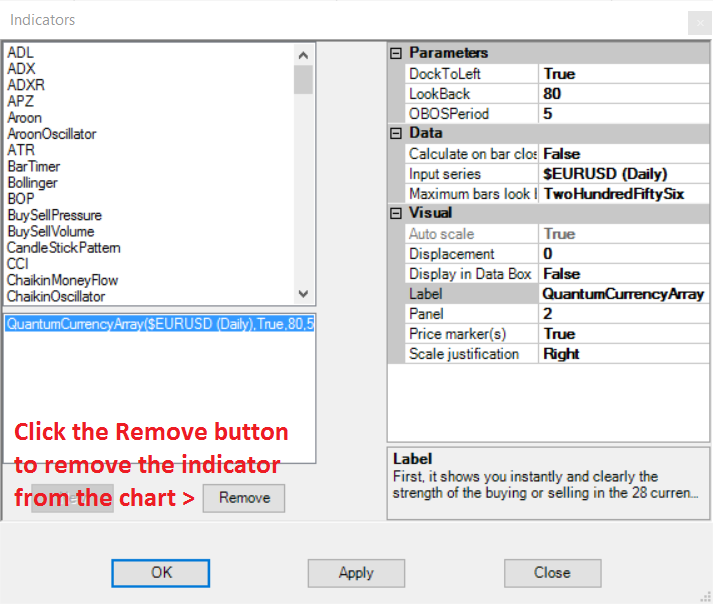 Simply left click on the Remove button as shown above, and the indicator will disappear from the list of indicators on the chart. To confirm left click the OK button to confirm and close the window.